Categories:
UI/UX Design
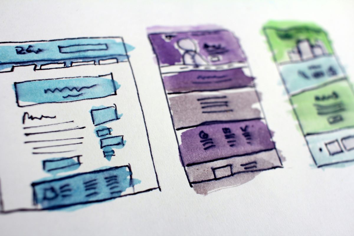
Visual Hierarchy: Designing for Clarity and Impact
February 18, 2025
In today’s digital landscape, capturing and retaining user attention is more challenging than ever. As designers, we must ensure that every element on a page communicates the intended message efficiently. Visual hierarchy is a crucial principle that guides users through content, emphasizing key information while minimizing distractions. By thoughtfully arranging elements on the interface, UI/UX teams can craft designs that are both aesthetically pleasing and functionally robust.
Visual hierarchy goes beyond mere layout—it’s about creating an experience that feels natural and intuitive. A well-structured design allows users to effortlessly navigate and interact with content, leading to improved usability and engagement. This blog will delve into five effective strategies UI/UX teams can implement to design visual hierarchy for clarity and impact. Each section will provide actionable insights to help you elevate your design projects and make user experiences more engaging.
1. Size and Scale: Emphasizing Through Proportion
Size is one of the most immediate indicators of importance on a page. By increasing the scale of certain elements, designers signal their significance relative to other components. Large headings, prominent call-to-action buttons, and bold imagery all serve to capture attention and guide the user’s eye to the most critical parts of the design. When elements are proportionally scaled, users can quickly understand what matters most, even in a glance.
Beyond simply enlarging elements, careful consideration of proportion helps create a balanced visual rhythm. UI/UX teams can experiment with varying sizes to denote the hierarchy of information. For instance, a product headline might be significantly larger than supporting text to immediately communicate its priority. In responsive design, ensuring that these proportions adjust well across different devices further emphasizes the content’s importance, maintaining clarity and impact regardless of screen size.
2. Color and Contrast: Drawing Attention with Visual Cues
Color and contrast are powerful tools in establishing a visual hierarchy. By using contrasting hues and varying saturation levels, designers can direct attention toward specific elements. High-contrast areas often serve as focal points, such as buttons or important notices, while subtler tones can indicate secondary information. This intentional use of color not only enhances readability but also creates a visually engaging narrative.
In addition to contrast, a harmonious color palette contributes to the overall aesthetics and usability of a design. Thoughtfully selected colors that align with brand identity reinforce consistency and can subtly indicate the importance of elements. For example, a vibrant accent color can be used sparingly to highlight interactive elements, whereas muted backgrounds can provide a clean canvas for more significant content. By balancing these elements, designers ensure that the visual hierarchy is both intuitive and visually compelling.
3. Typography and Spacing: Establishing Order Through Text
Typography plays a central role in organizing content on a page. The choice of font style, weight, and size can communicate the level of importance and establish a clear hierarchy. Headings, subheadings, and body text should be clearly differentiated, allowing users to scan the page and understand the structure at a glance. For instance, a bold, large font for headlines immediately signals primary information, while lighter, smaller fonts for supporting details suggest a secondary level of importance.
Spacing, or white space, is equally crucial in reinforcing this hierarchy. Adequate spacing around text elements not only improves readability but also prevents the interface from feeling cluttered. Strategic use of margins and padding can isolate key content areas, drawing the user’s focus exactly where it’s needed. When typography and spacing work together harmoniously, the design achieves a sense of order and clarity that guides users seamlessly through the content.
4. Layout and Grid Systems: Structuring the Design for Clarity
A well-defined layout is the backbone of any successful UI/UX design. Grid systems provide a structured approach to organizing content, ensuring that elements align consistently across the interface. By adhering to a grid, designers create a cohesive look that allows users to predict where information will appear. This predictability not only improves usability but also enhances the overall aesthetic appeal of the design.
In addition to grids, the strategic placement of elements within the layout further reinforces visual hierarchy. Grouping related items together and aligning them logically helps users make connections between different parts of the interface. For example, a product image paired with its description benefits from being placed in close proximity, reinforcing their relationship. This methodical approach to layout ensures that every component has its rightful place, leading to a design that is both organized and impactful.
5. Visual Flow and Consistency: Guiding the User Journey
Visual flow refers to the natural path a user’s eyes follow as they navigate through a design. Establishing a clear visual flow is critical in guiding users from one element to the next in a logical sequence. Designers can achieve this by employing directional cues such as arrows, lines, or even the natural arrangement of content. When users can easily follow the intended flow, the experience becomes more intuitive and satisfying.
Consistency in design further reinforces this visual flow. Repeating design patterns and maintaining a uniform style across all pages create a familiar environment for the user. Whether it’s the consistent use of icons, buttons, or navigation menus, this continuity helps users feel comfortable and in control of their journey. A well-executed visual flow, combined with design consistency, results in a seamless experience that keeps users engaged and informed throughout their interaction with the product.
Finding Your Future in UI/UX
Crafting an effective visual hierarchy is a multifaceted process that involves much more than merely arranging elements on a page. It requires a deep understanding of how users interact with digital content and a strategic application of design principles to lead them through a thoughtful, coherent experience. From leveraging size and scale to establish importance, to employing color, contrast, typography, and spacing for clarity, each component plays a pivotal role in shaping a user-friendly interface.
Utilizing structured layouts and grid systems not only enhances visual organization but also underpins the overall design integrity. Moreover, guiding the visual flow with consistency ensures that users are always aware of what’s important, reducing cognitive load and making the interaction both enjoyable and efficient. By integrating these strategies, UI/UX teams can create designs that are not only visually appealing but also functionally superior, ultimately leading to higher user satisfaction and engagement.
For industry leaders and aspiring designers looking to sharpen their skills in modern UI/UX design, the WorkForce Institute offers an accelerated UI/UX design program. This comprehensive program is designed to upskill or reskill students with the latest best practices in the industry. By participating in this bootcamp, you'll gain hands-on experience, learn innovative techniques, and receive expert guidance to excel in the competitive world of digital design. Embrace the opportunity to enhance your design expertise and make a significant impact in your organization by enrolling in WorkForce Institute’s UI/UX design bootcamp today!
February 18, 2025
Related Posts